
Case Study: Refreshing and relaunching a brand identity

Meet the Client
Nellie’s is a gender-based violence organization in Toronto. Since 1973, Nellie’s has been a place of respite and rejuvenation for women and their children fleeing violence, abuse, and homelessness.
We first began working with Nellie’s in 2018 when we were hired to write a single impact story about their children’s program for the funder. That piece helped Nellie’s secure additional funding. From there, we began supporting Nellie’s with multiple donor communications pieces. (See Case Study: Creating continual donor-centric content and Case Study: Easing the burden of producing an annual report.)
The Client’s Challenge
2023 marked 50 years since Nellie’s opened. And while they had long been known as a crisis organization for women and their children escaping violence, today they were so much more.
To better reflect all the facets of the organization, including the work they’re doing to break the cycle of violence, the board drafted a revised mission statement, vision and values, bringing the organization in line with the Nellie’s of today and the Nellie’s of the future.
Now, Nellie’s needed its brand to reflect the bold new statements.
Our Solution
Considering the breadth and depth of the task, we partnered with Varga Girl Design and Kosmic Creative to provide a seamless one-point-of-contact experience for Nellie’s.
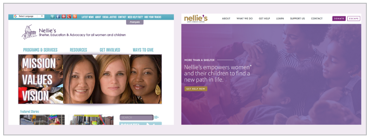
Rachel Ott, the brains behind Varga Girl Design, conceived a logo design inspired by the versatile nature of the apostrophe, drawing on its symbolic significance in language and communications.
The apostrophe represents ownership, underlining the client’s distinct presence and agency of their own being. Additionally, it can be seen as an end quote, which signifies expression and having a voice; and it can also resemble a pause or comma, which signifies a moment of reflection and rejuvenation. Finally, the logo itself is a graphic comprised of the wordmark with the two Ls creating a roof-like shape that pays tribute to Nellie’s historical past as (solely) a shelter.
This logo was approved by all members of the board without any revisions.
Now the work really began. Because a brand is more than words on a page or a pretty logo — a brand is the entire essence of an organization and if it is not launched correctly, it will lead to confused and frustrated audiences.

Over the next six months, we wrote and/or revised and designed close to 30 pieces of marketing collateral. This included brochures, booklets, posters, fact sheets, pop-up banners, email signatures, letterhead, business cards, swag, tax receipts, and more, all while keeping our client updated through regular status meetings. We also brought in a French translator so that several key pieces would be bilingual.
We tackled the website at the same time. The existing site was confusing to navigate, contained outdated information and wasn’t mobile friendly. As Nellie’s has multiple audiences visiting their website (donors, like-minded organizations, and clients) we started by creating a content strategy and redrafting the site map to ensure that it was accessible and relevant to all.
Over 30 pages of new content was written to create that emotional connection between the audience(s) and the organization. We worked closely with Nellie’s throughout the process to ensure the new drafts were kept organized and the process was as smooth as possible. Once the content was finalized, we worked with Katy Jonker, at Kosmic Creative, to design a beautiful new website — one that was a true reflection of the new visual identity and messaging.
Finally, we prepared new social media assets and templated letters announcing the big reveal and the story behind the rebrand.
On October 1, 2024, Nellie’s unveiled the refreshed brand at its AGM, while simultaneously launching the new website and shouting the news from the (social media) rooftops!
After more than 50 years of Nellie’s, we wish we could say that gender-based violence was decreasing. But it’s not. Nellie’s is as needed today as it was when it opened its doors in 1973. We are proud to have played this important role in helping Nellie’s create its future and our hope is by the time Nellie’s celebrates 100 years, there will be less of a need for crisis organizations.
Testimonial
“Changing Nellie’s brand was not an easy decision. Our original logo was a large part of our identity for 50 years. And the way we communicated about our work hadn’t changed in decades. To make such a monumental change to a new logo, as well as updating our website and every piece of internal and external communication, could only be done with an agency we trusted. And we trusted Luminate. Since 2018, Luminate has guided how we connect to our community of donors, which in turn has helped us grow our fundraising and increase our social media presence.
Luminate directed our rebrand with appreciation of our history, expertise in their field and great time management. We were supported in all aspects of the rebrand, including presenting our new visual identity to staff.
What felt like a daunting job at the onset, in the end was a seamless process. I can’t thank Luminate enough for their amazing work in setting Nellie’s up for the next 50 years.”
- Ingrid Graham, Director of Development & Acting Co-Executive Director